UX RESEARCH CASE STUDY:
REINVENTING A MUSIC STREAMING SERVICE
Link to Figma Project
For years, Spotify and Apple Music have the top streaming services for a number of reasons - friendly interface, ease of use, etc. For a while, it seemed the majority of users just stuck with the service they first signed up for, perhaps the ease of use, habit of using the app, and saved playlists kept folks on (this was certainly the case for myself).
Lately though, as of August 2025, I have noticed a lot of people in my direct circle shift away from Spotify in particular as their preferred music and podcast streaming service. Some switched away from Spotify because of the price (YouTube Premium subscribers already receive YouTube Music in their subscription - same with Amazon Prime with Amazon Music), some switched from Spotify because of Daniel Ek’s politics, and some switched because of a newfound appreciation for higher quality audio.
My wife and I both have recently made the switch from Spotify to YouTube Music, for a mix of all the reasons stated above (mainly I want higher quality audio, and she already pays for YouTube premium). However, since the switch, we have regularly been chatting about the user experience of the app - it’s not as intuitive as Spotify or even Apple Music. The homepage is messy, with suggestions all over the place, some of the app’s personalized top suggestions aren’t things we’d consider to be on-point, and overall it’s been a bit of a learning curve to understand how to efficiently use the app.
This project is a deeper look into the homepage of a streaming service platform, and what it would take to convince a user to switch away from something they’re used to using. In this case, I’ll ask (via survey) what matters to users and why, and using the results I’ll develop some wireframes and UI for the homepage of a streaming service platform (let’s say a “redone” version of YouTube Music) that actually gives the people what they want.
The main focus of this project is UX Research and basic Wireframing.
Goal Statement: A new music streaming app that will let users stream high quality lossless audio, donate directly to artists, and all other expected functions, which will affect both user’s and musician’s needs and values. The effectiveness can be measured by downloads of the app, tracking artist donations, and auditing “Now Listening” data to calculate monthly listeners.
Google Forms questions for research:
1. What streaming service do you use (if at all)
2. Why do you use it? (Or why don’t you use a streaming service?) - what do you look for
3. What’s the first thing you typically do on the app? - user behavior
(search for something, go to a playlist, click a suggestion off the homepage, play a radio station, other)
4. On a scale of 1 (poor) to 5 (amazing), how intuitive in the homepage interface to you (ease of use, suggestions provided, etc)
5. Would you consider switching to another streaming service? - pain points(Yes/No/Maybe)
6. If so, what would be needed to convince you to switch? (Think experience, not price)
7. Anything else you’d like to add?
What Matters Most:
User Testing 1
Results & Thoughts:
First of all, the results of this survey really showed me the importance to asking the right questions.
I received really great insight/data from users, but reading through everything often left me with more follow-up questions.
Maybe I had too many text boxes and should have been more strategic with turning those questions into multiple choice.
Lesson learned. Either way, I have enough data to make some informed decisions on next steps. But first, let’s go over the results:

Questions 1 & 2:
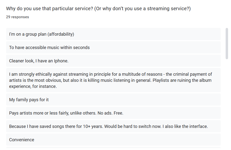
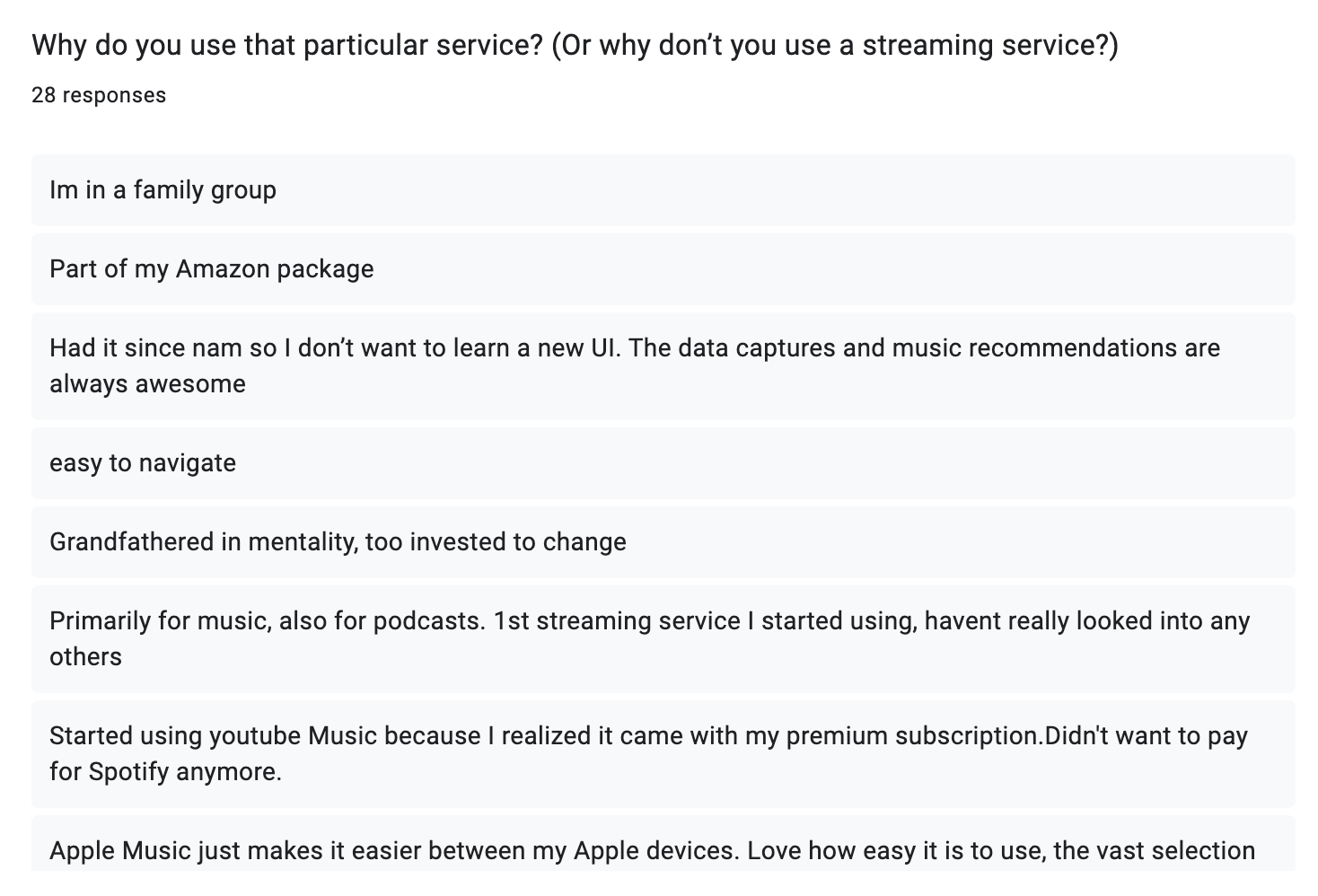
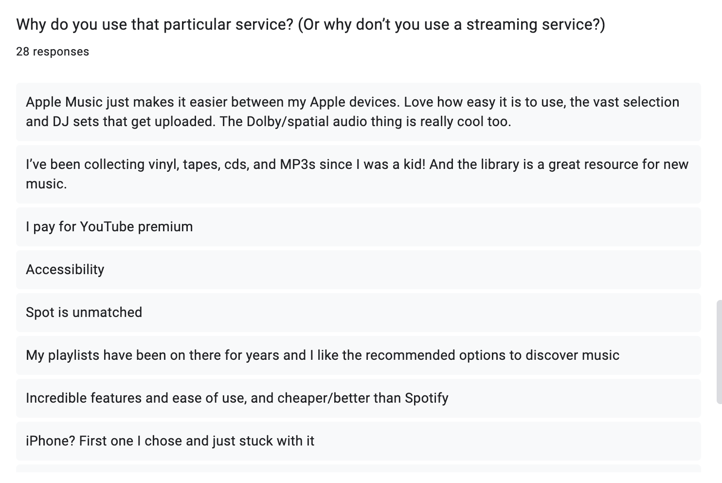

According to the pie chart, and contrary to what I see in my circle, a lot of people are deciding to stick with Spotify!
With question 2, I see a trend of people sticking with their preferred service mainly because of either convenience (they’re just used to the app and aren’t interested in something new) or because they are too invested (they have years of saved songs and playlists and don’t want to “start over”.
Here’s what I see that matters most to people (the why):
- Affordability (group plan, family plan, “it’s cheapest”, already paying for a joined service, etc)
- Accessibility (clean UI, easy to search for artists/albums/playlists, good recommendations)
- Routine (grandfathered mentality, don’t want to learn new UI, too invested, saved songs/playlists for years)
And for the few who don’t use a streaming service, the main reason they don’t is because of unfair pay to artists.

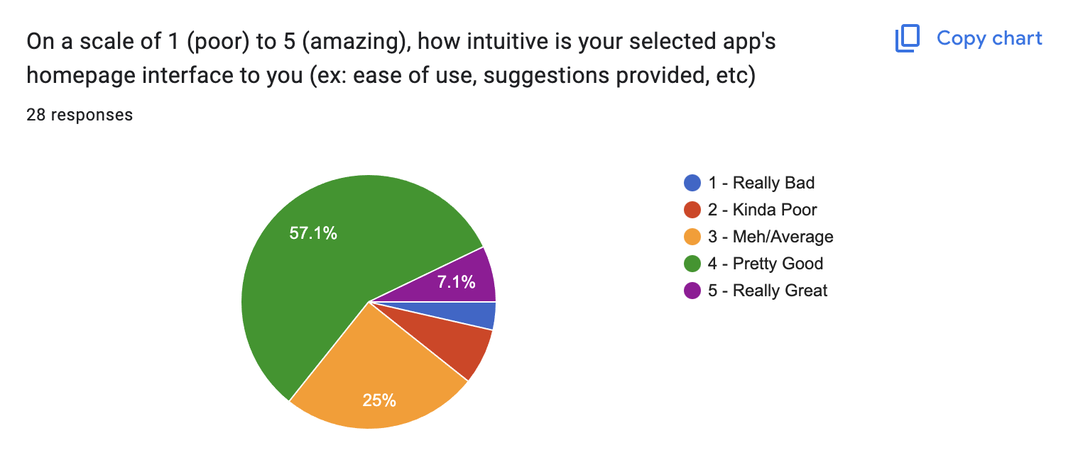
Questions 3, 4 & 5:


Most people either:
- use the search functionality for something
- navigate to a saved playlist.
- select a “for you” playlist (AI made)
The majority of people seem to be okay with their app’s homepage UI.
Now despite the answers for questions 1-4, the majority of users (16 out of 28) said either Yes or Maybe to switching to another streaming service. This is interesting, as it shows curiosity in users and means they may not actually be tied down to the reason WHY they use their preferred app. So, this begs the question: what would it take to convince users to switch to a new streaming service? As we’ll see below, a mixture of maintaining ease for natural user behavior (i.e. what they tend to do on their app) and resolving pain points could be the key.
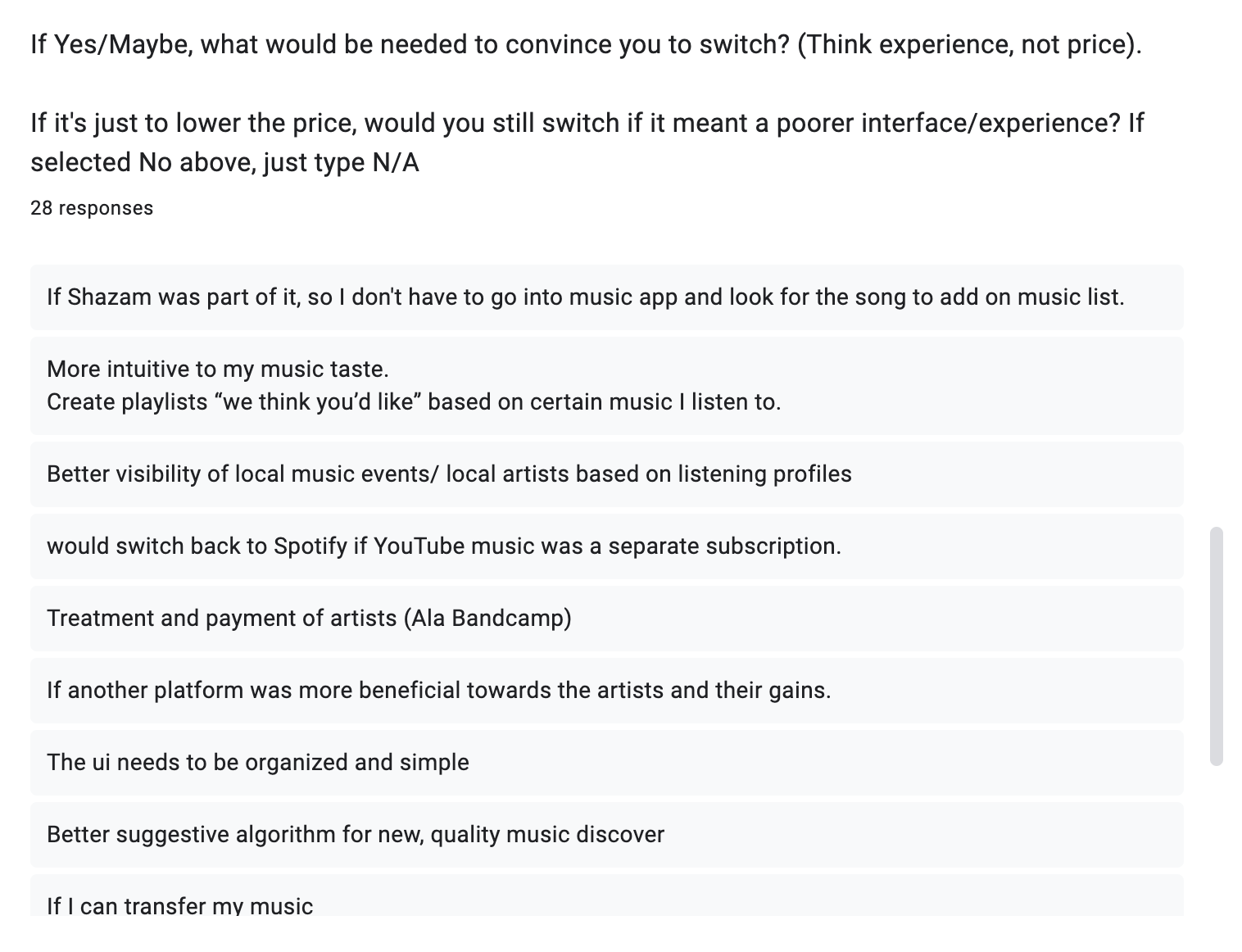
Questions 6 & 7:
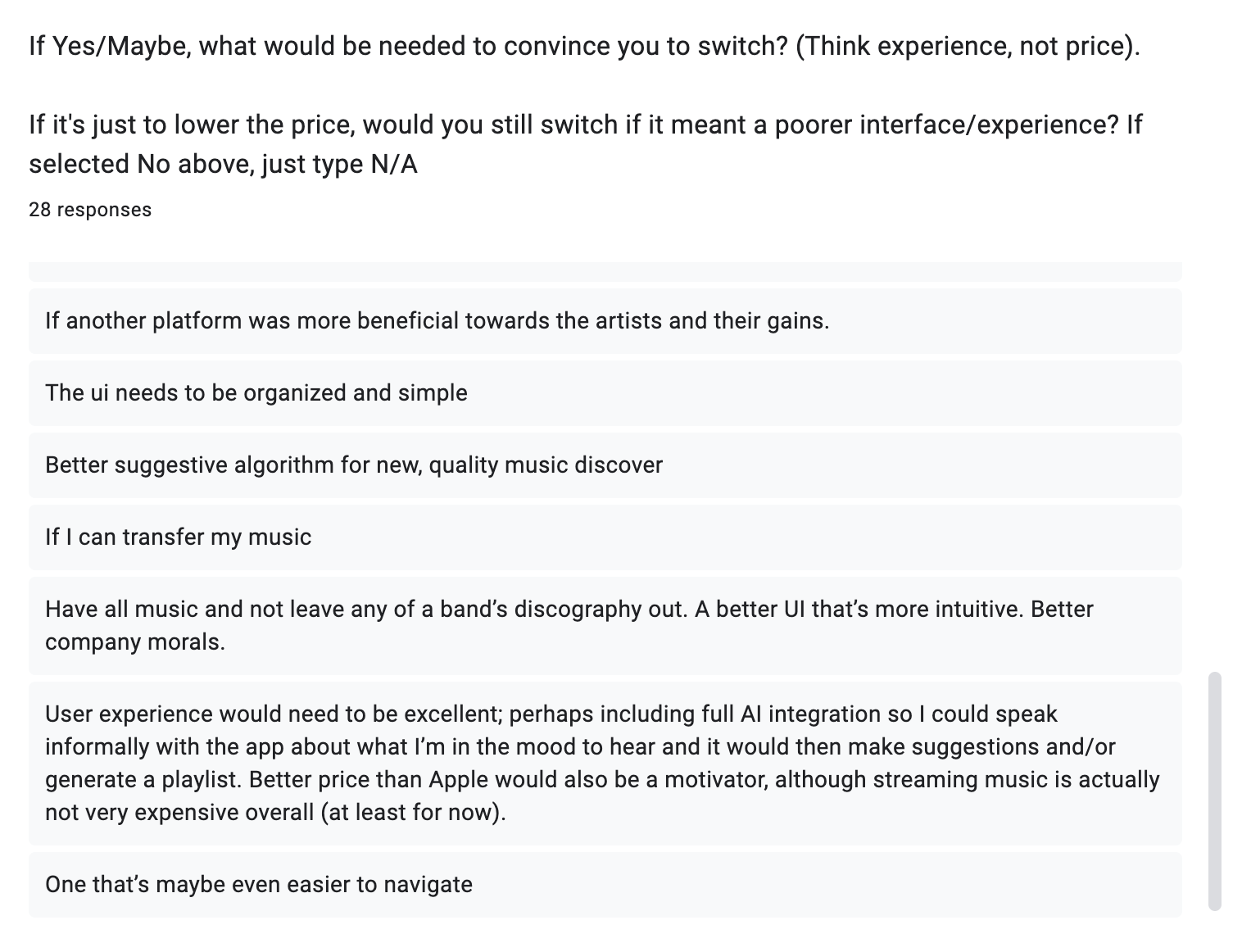
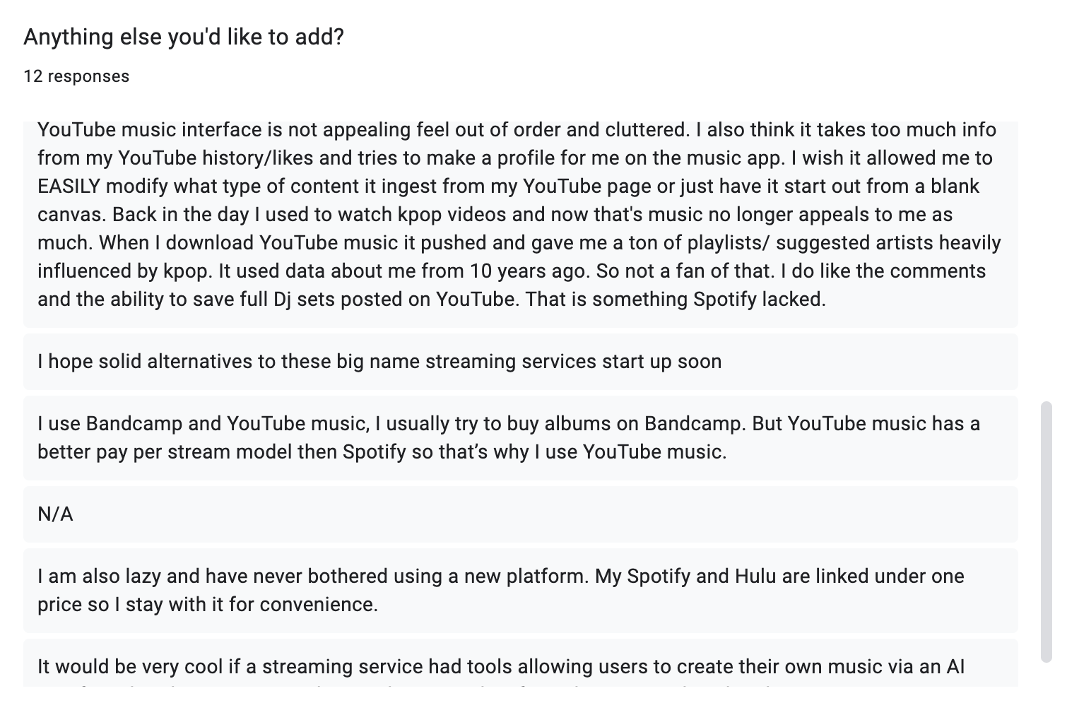
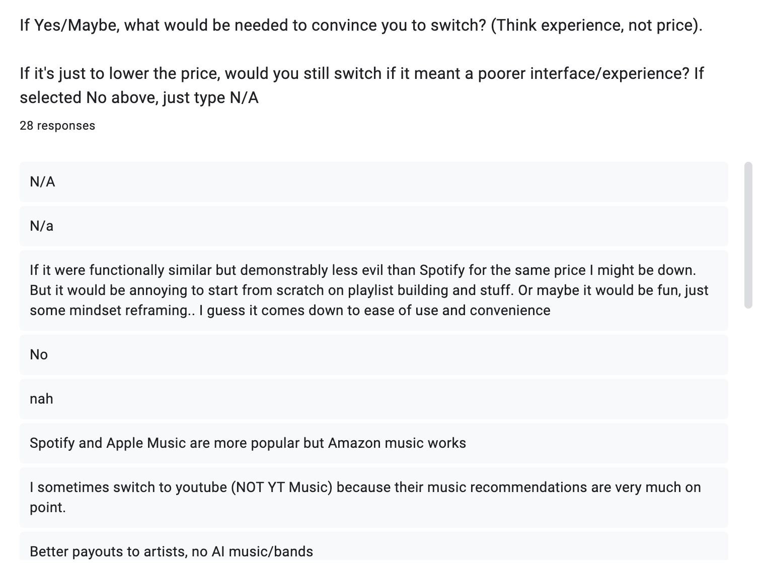
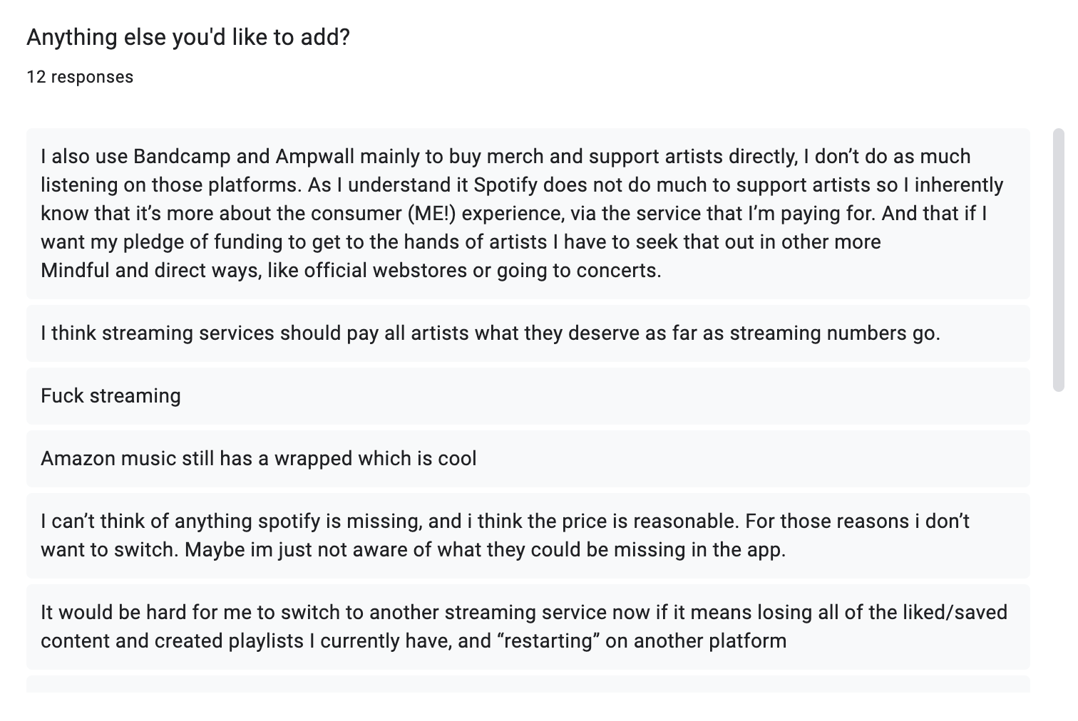
As we see in these answers, here’s a little more on what matters to users, enough to actually make them switch platforms:
- Better payment to artists (and company morals)
- Outstanding UX/UI (better than current app, not too busy)
- Option to transfer music (so they don’t have to “start over”)
- Perhaps a feature other services don’t have
Overall, it seems (and is understandable) that users like to stay in their routines. However, it is clear that they are at the very least curious about other platforms, and would make the move if it checked all the boxes for them. With this in mind, I have enough to draft personas and a homepage, artist, and account page that could fit these users’ needs.
Personas:
As mentioned in the first survey’s results section, I discovered what matters most to users:
- Affordability
- Ease of Use (Accessibility & Familiar Routine)
- Company Morals (mainly better payout to artists)
With these in mind, I can create three personas to assist in the first iteration of wireframing/prototyping:
The Saver

financially responsible
opts for budget items
okay with less premium features
likes family/group plans
works a 9-5

The Minimalist
perhaps busy parent
spends more time in the “real-world”
likes tech easy and simple
just want something that “works”

The Moralist
supports companies with similar values
not afraid to question/boycott morally unethical organizations
wants to make sure their money goes to the right place
environmentalist
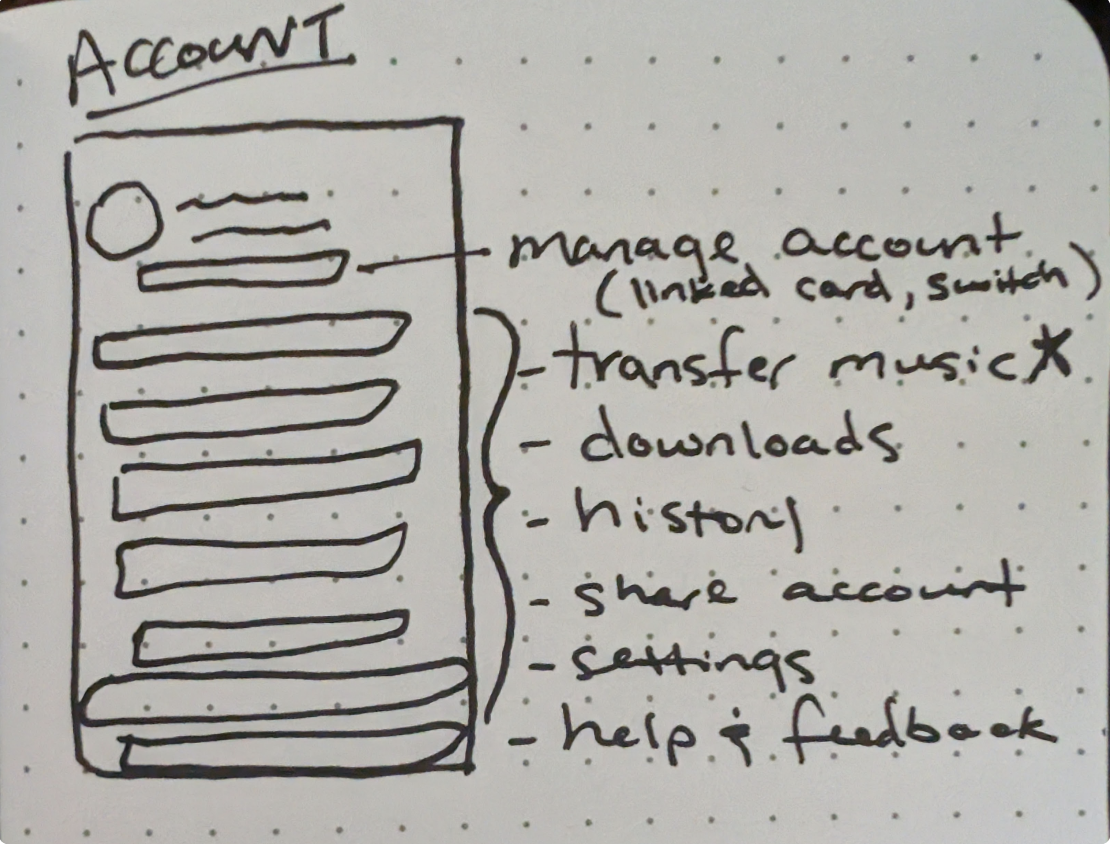
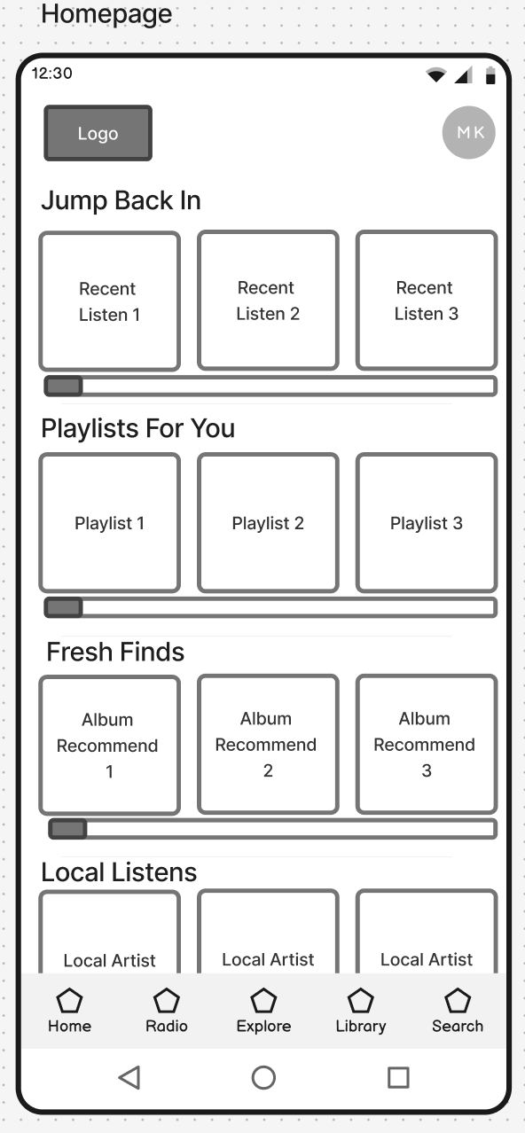
Paper & Digital
Wireframing
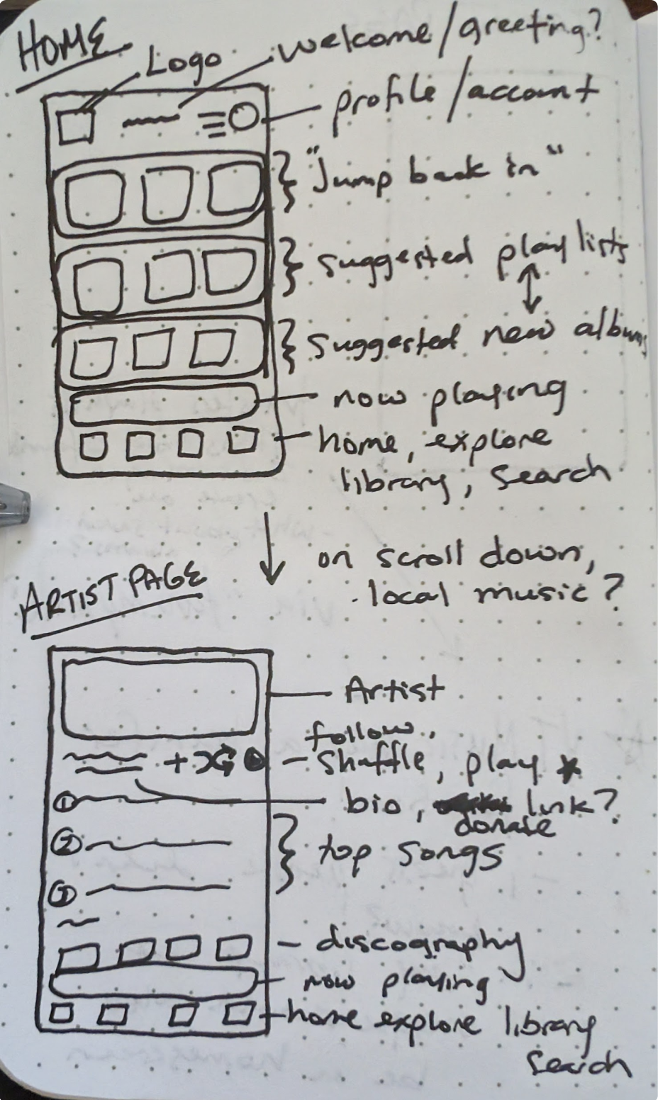
For this section, as stated before, I am going to focus on rebuilding YouTube Music’s homepage in a way that could meet the needs for the users I surveyed.
Upon wireframing and additional scrolling in the app (YouTube Music) I actually discovered there IS an option to transfer playlists from other apps. This is amazing - but it appears most users, including myself, didn’t know about this feature. The feature is located in the “Library” section, where one would go to see their Playlists, Podcasts, Songs, etc. I wonder if this feature was present or more pronounced on the homepage, if it would capture long-time interest of users who may download the app to try it out.
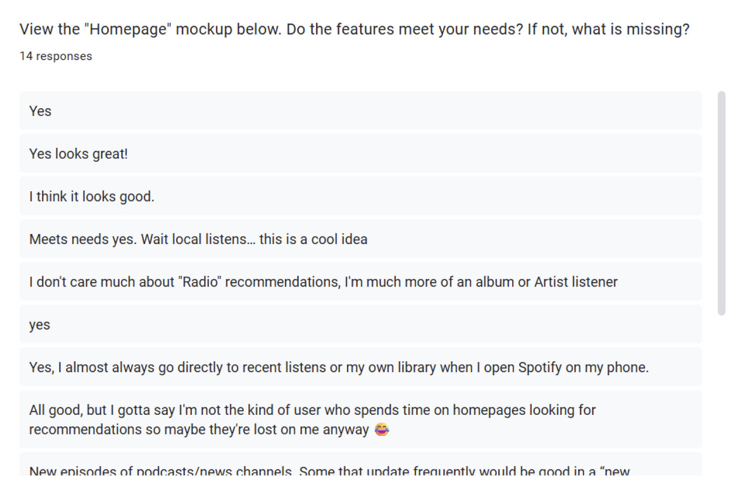
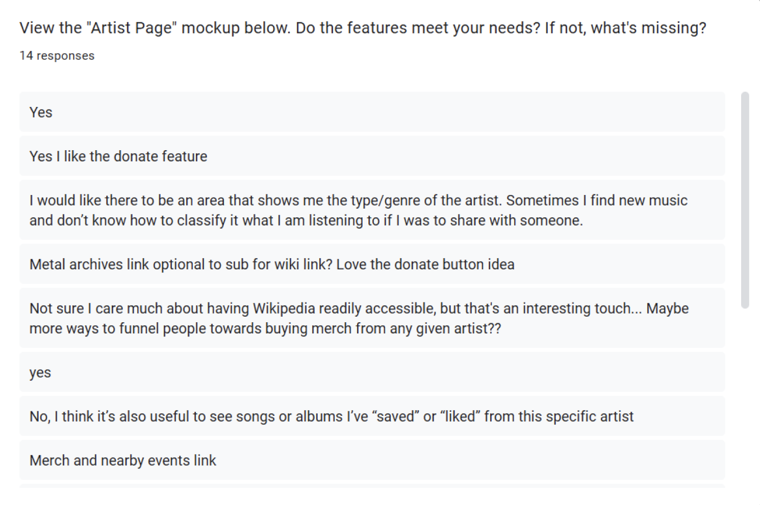
I sent out a follow-up survey for feedback on the first rendition of a lo-fi mockup as seen above. Just four questions, the first three highlighting each page of the app, and asking if it does or does not meet the user’s needs. The last question asks for any additional thoughts or comments. The results of this survey will help with iteration of future prototypes.
Community Opinions:
User Testing 2 & Results
Question 1:

Question 2:

Question 3:

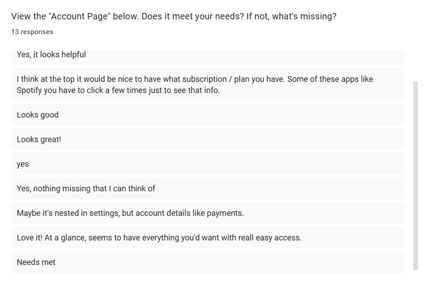
Question 4:

Most needs are met, with some additional suggestions that could benefit users as a whole
“Playlists For You” could be a mix of that AND “Your Playlists” - recommendations to the user from both community and their own playlists… Maybe even changes depending day of week and time of day (ex: high intensity music in the morning, calming ambient before bed, etc.)
Artist Events on Artist Page - this is a popular opinion
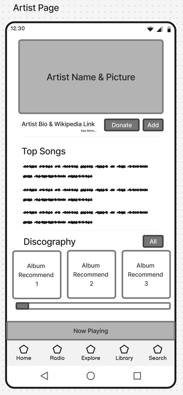
“Add” on Artist Page isn’t obvious… Could be “Add to:” with options being library, playlist, etc.
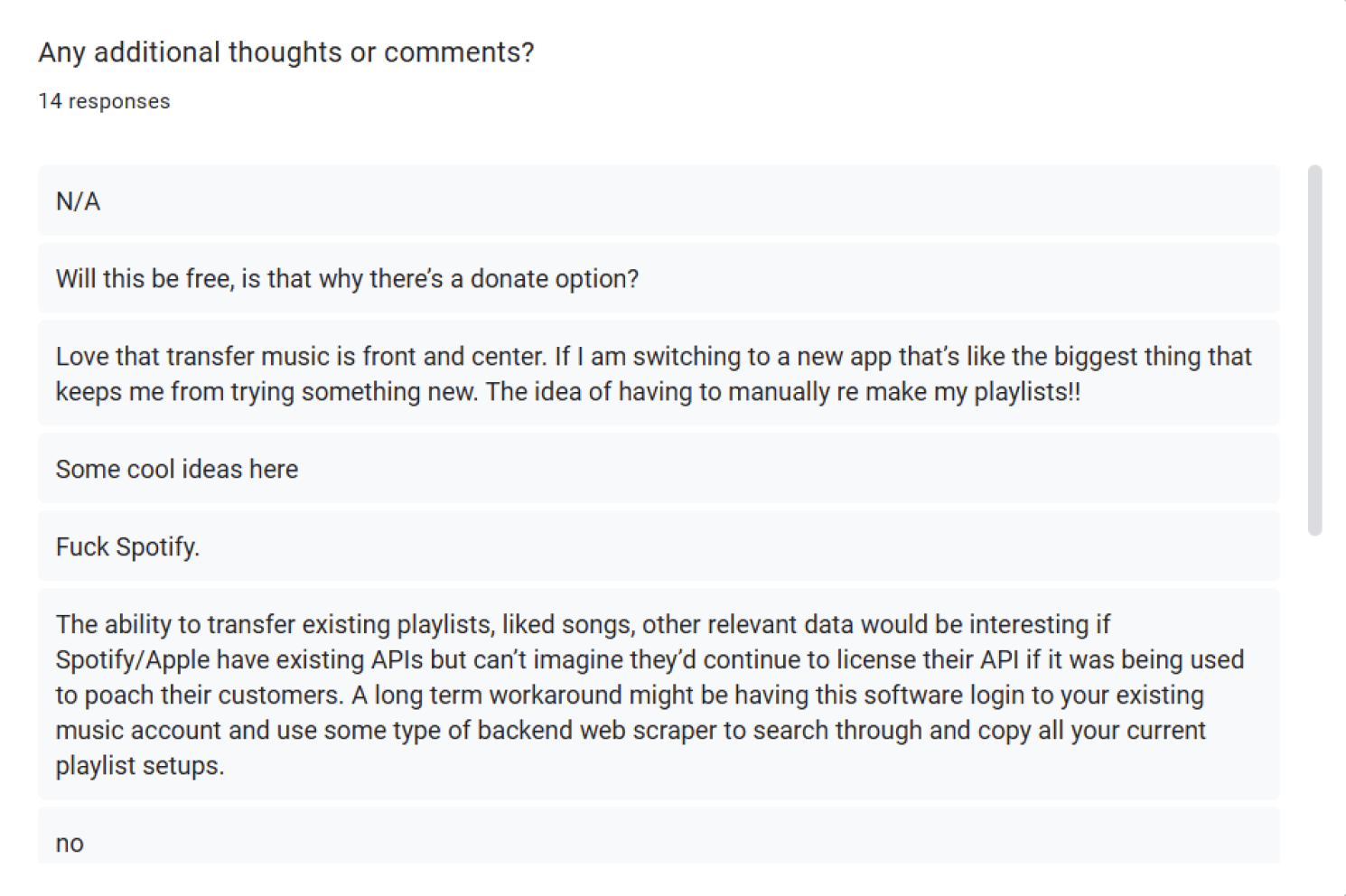
Transfer Music and Donate to Artists is a hit
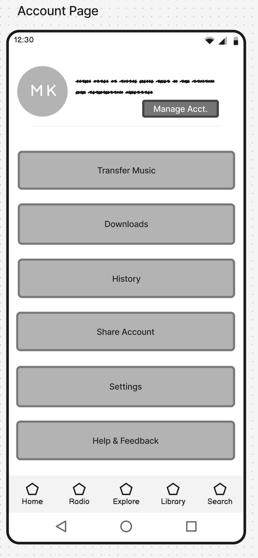
Some people wonder about account settings like payment… I imagined this would be in “Manage” but maybe that’s not obvious
Icons/link to artist-run pages (i.e. social media) where Artist Bio and Wikipedia Link resides… Wikipedia Link may not be as important to people anyway
Section with “Artist Bio/Donate/Add to” could also have the genre of the artist, with “Similar Artists” at bottom of page, or “Artists in this genre” AI playlists
After the second survey was sent out, I received a good amount of insight from users on the prototype. Here’s what I learned:
Conclusion &
Thoughts on Next Steps
As a reminder, this project is meant to be a focus on the UX Research & Lo-Fi Design part of the UX Design process. This is why the project ends here, without going too far into hi-fi prototypes and UI Design. HOWEVER, if I were to continue, or revisit in the future, these would be my next steps:
continue to iterate based on user feedback
design some hi-fi mockups and a prototype to have users test in real life
observe the user testing process and note highlights and pain points
polish the UI
work on specifications to hand over to developers for the application build
design some hi-fi mockups and a prototype to have users test in real life
observe the user testing process and note highlights and pain points
polish the UI
work on specifications to hand over to developers for the application build