Page in progress! *** Working on user testing with the prototype
Project Overview
Project Name: PayTix Redesign
My Role: Lead UX Researcher / Lead UX Designer
Tools Used: Figma, Google Forms (Surveys)
Problem Statement: The current PayTix app suffers from usability, reliability, and trust problems that slow users down, cause confusion, and erode confidence in the payment process, which adds friction to an already stressful task.
Design Goal: Redesign PayTix to be fast, transparent, and trustworthy. The app should let users quickly and confidently pay or dispute a ticket, provide clear status updates, and minimize cognitive and technical friction. The new UX should help people resolve citations with minimal effort and anxiety so they can move on with their day.
Context & Background
What is PayTix?
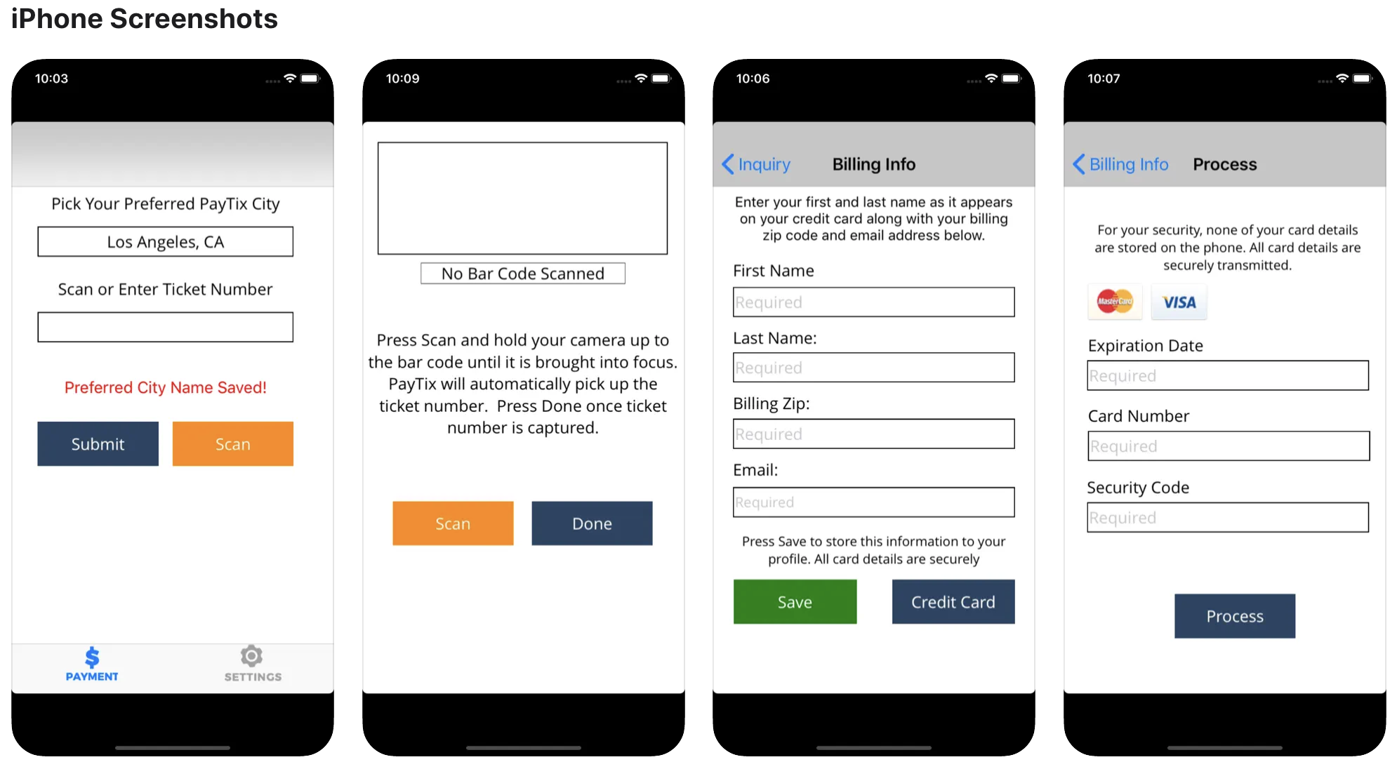
PayTix is a mobile application that allows users in participating U.S. municipalities to pay parking citations (or check for them) directly via smartphone. It is integrated with city parking systems, with claim that it does not store credit card data and is fully PCI-DSS compliant. The app’s value proposition is that it offers a “simple, quick ticket payment process” including barcode scanning or manual entry of ticket number, reminders, and a history or “ticket list.”
In Los Angeles, for example, PayTix is a supported option for paying parking citations, alongside web, mail, or in-person methods.
Cities like Boston also adopted PayTix as part of efforts to modernize public services and reduce friction in civic transactions.
Why the Redesign Is Needed
Despite its intended usefulness, PayTix is broadly criticized in user feedback for being unreliable and low in usability, which undermines confidence in the app. Its low user ratings reflect widespread dissatisfaction.
Some of the most common complaints include:
Crashes and instability
“Crash a lot. Especially in the ticket list … once you go to one ticket, … app crash immediately.”
“The app doesn’t even work … links to pay on their website do not work.”Poor feedback, trust issues & lack of confirmation
“This app is really poorly designed. I thought I was getting phished … Hope my credit card info isn’t stolen using it.”
“Double charged me, and won’t respond to my messages … no email confirmation … no phone number listed.”Feature gaps & legacy UX patterns
“Doesn’t let you use your Google wallet … so you have to get out your physical card to input the number.”
“Only allows you to manually enter your card information. There is no autofill compatibility. … I doubt it has the proper security for a mediocre app.”Dispute / verification ambiguity and lack of updates
Some users report that the app can’t find their violation, or the appeal functionality and pay links don’t function properly.
Also, cities require clear paths for contesting citations (such as uploading evidence), but the app gives little transparency or workflow support for those actions.
Taken together, these issues contradict PayTix’s promise of “fast, reliable, trustworthy citation resolution.”
* Sources include public reviews on both Google Play Store and Apple’s App Store
The Design Opportunity
How might we redesign PayTix into a tool that lets users rapidly and confidently pay or dispute citations, track progress, and gain peace of mind without unnecessary friction?
More specifically, the redesign should address these opportunity areas:
Robust, crash-free core flows: stabilize ticket lookup, switching between tickets, reloading, and payment confirmation with graceful error recovery
Trust & transparency: better feedback messages, clear confirmation & receipt delivery, visible status tracking, and trust signals (security, credibility)
Dispute / appeal path support: enable users to initiate contests, upload supporting documentation, view outcomes (or statuses) from within the app
Modern payment convenience: support device-native payment methods (wallets, autofill), reduce manual data entry, and ensure clarity on fees before payment
Notification & reminders: timely alerts about due dates, status updates, or outstanding actions
Accessible and intuitive UI: minimal cognitive load, legible typography, clear affordances, and resilience for edge cases (e.g. ticket not yet in system)
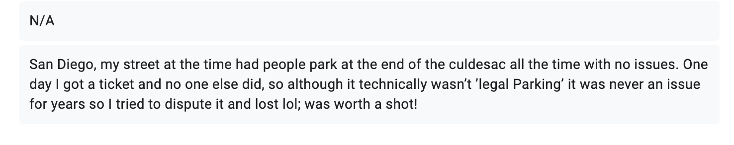
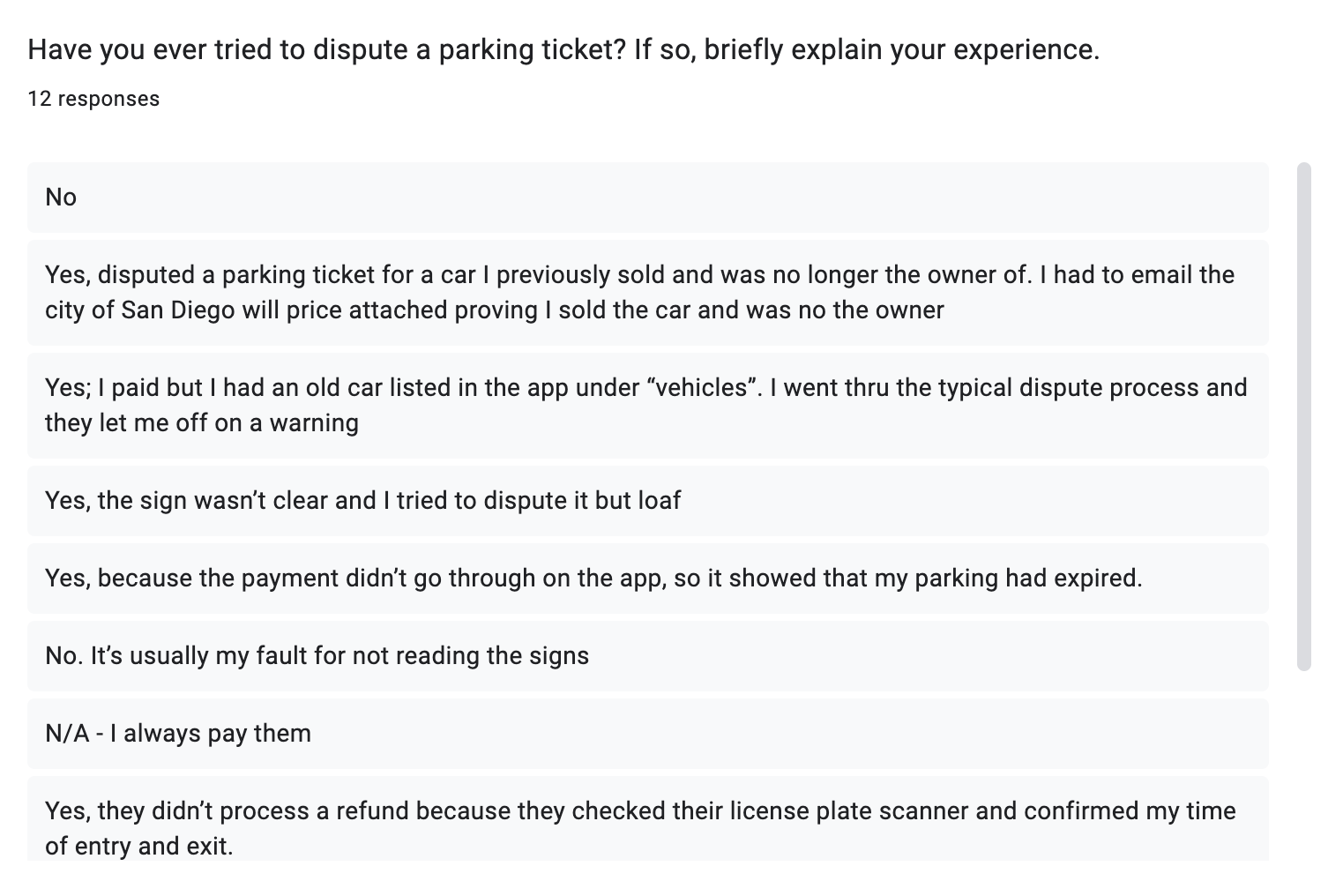
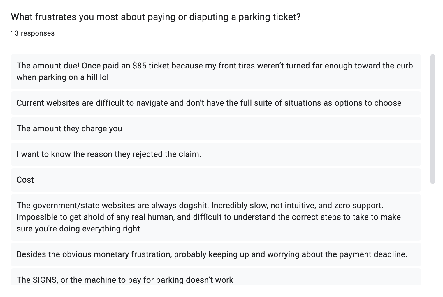
From the Community: User Research & Insights
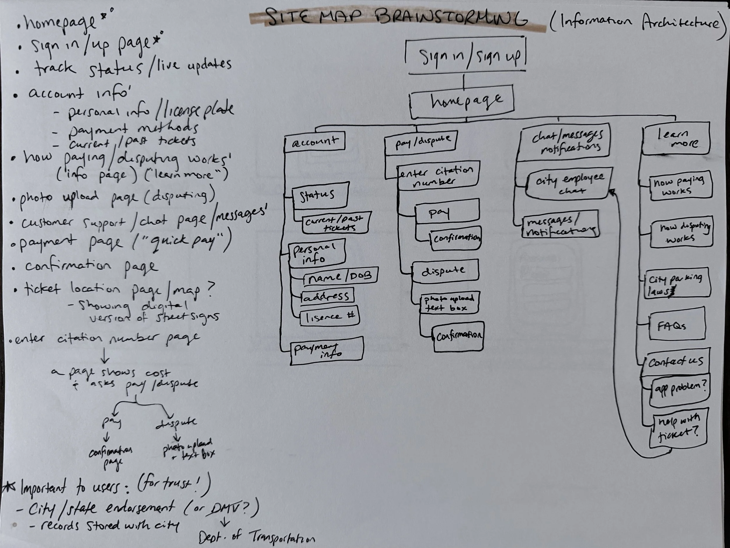
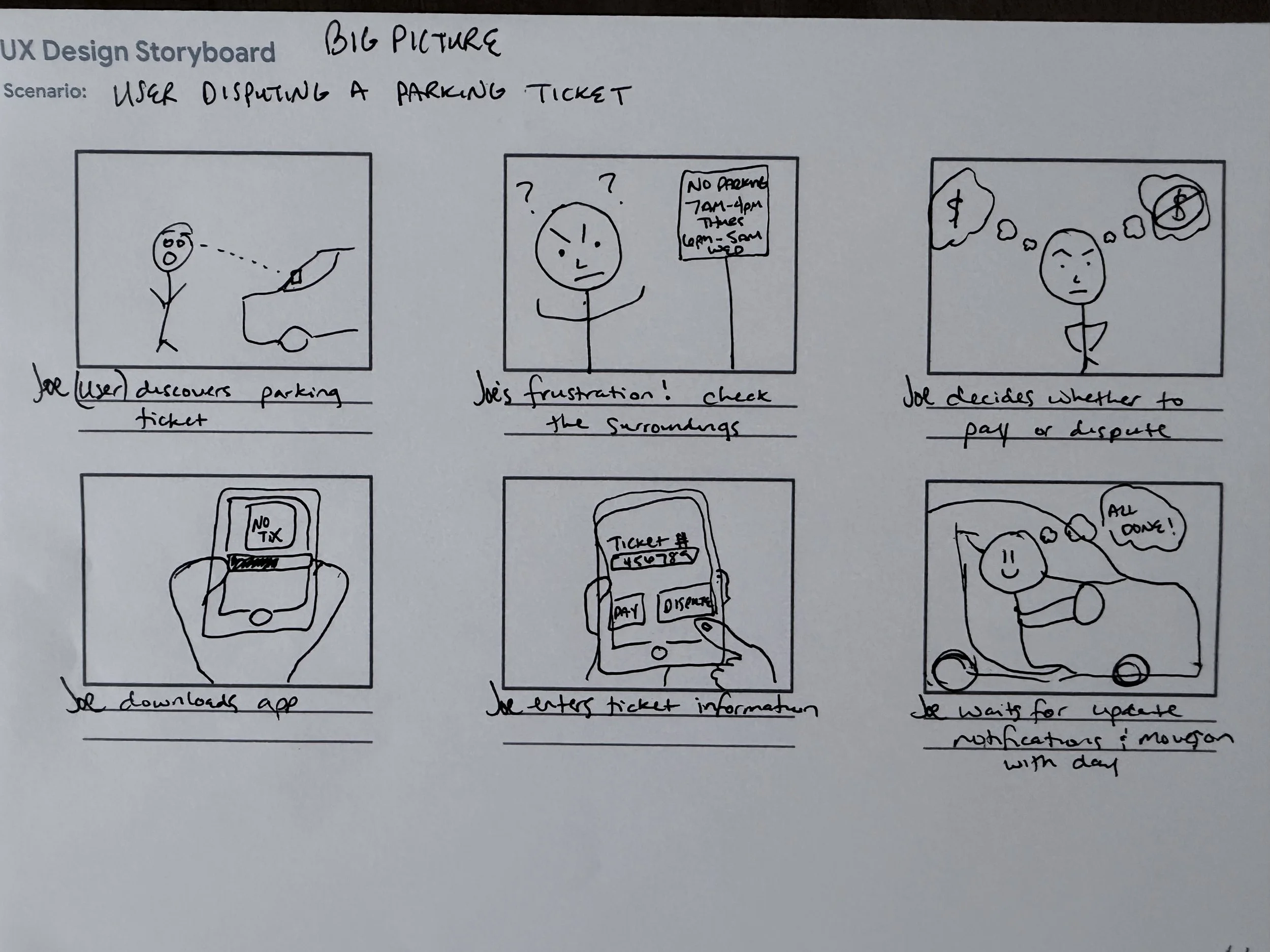
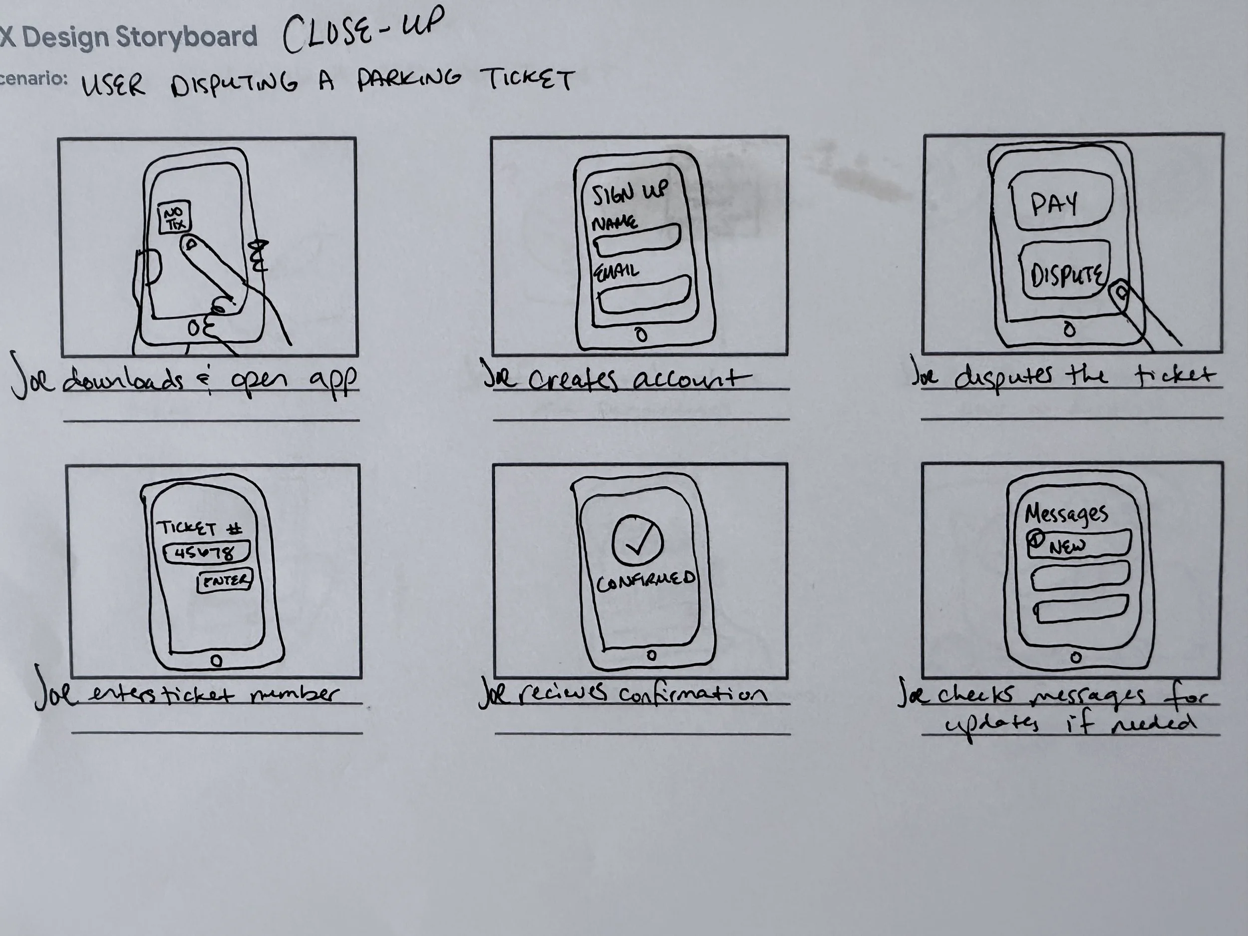
Site Map (Information Architecture) & Storyboards
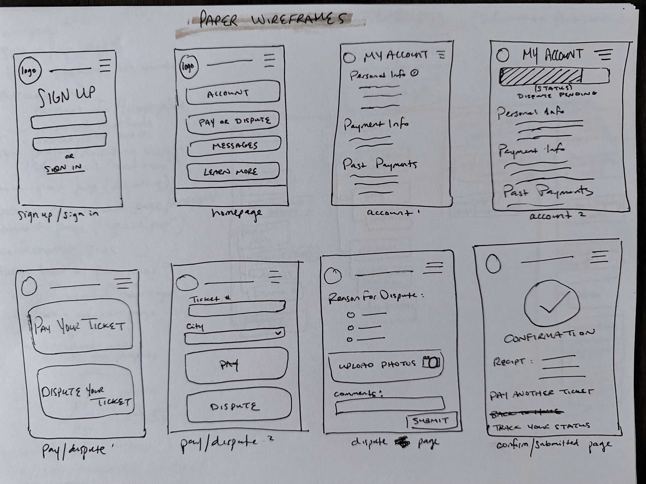
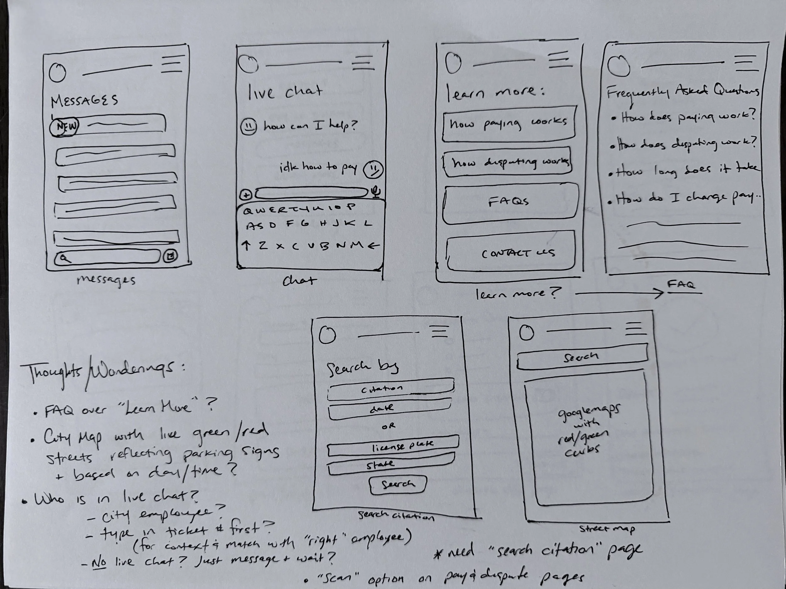
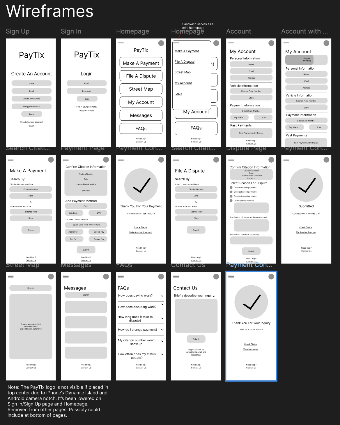
Paper & Digital Wireframes
Lo-Fi Prototype
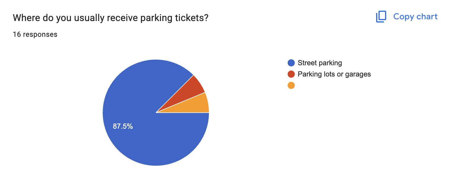
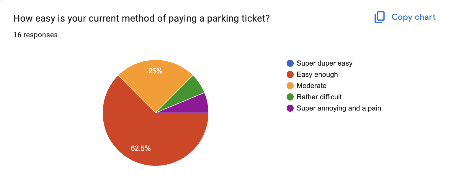
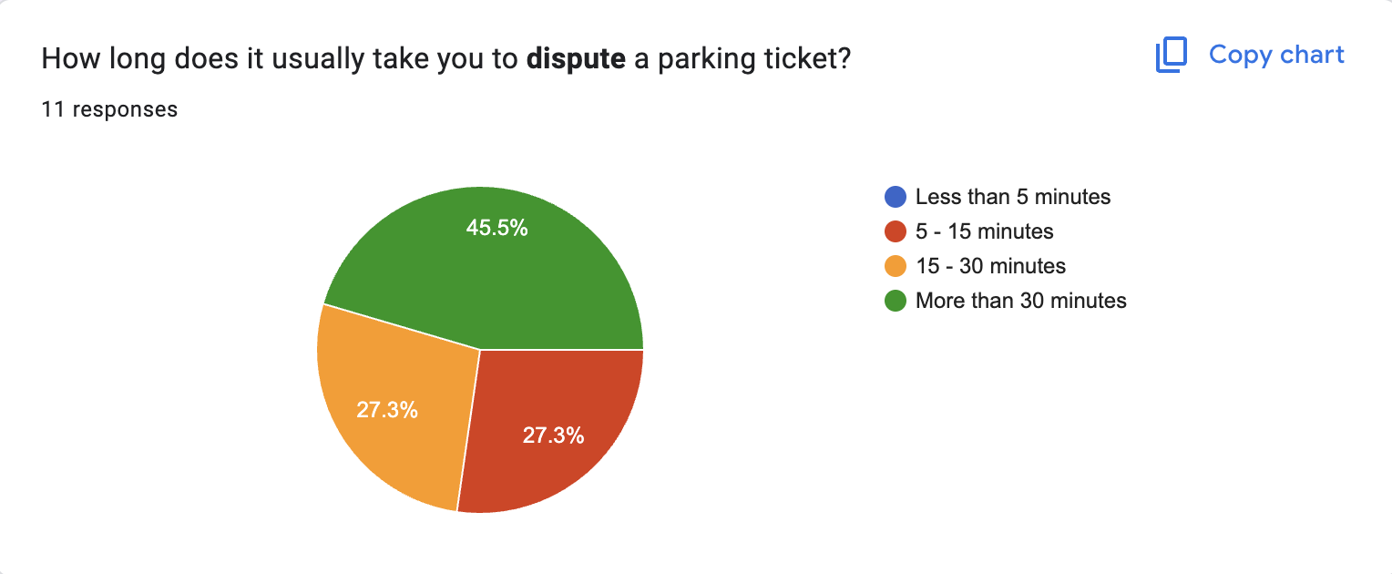
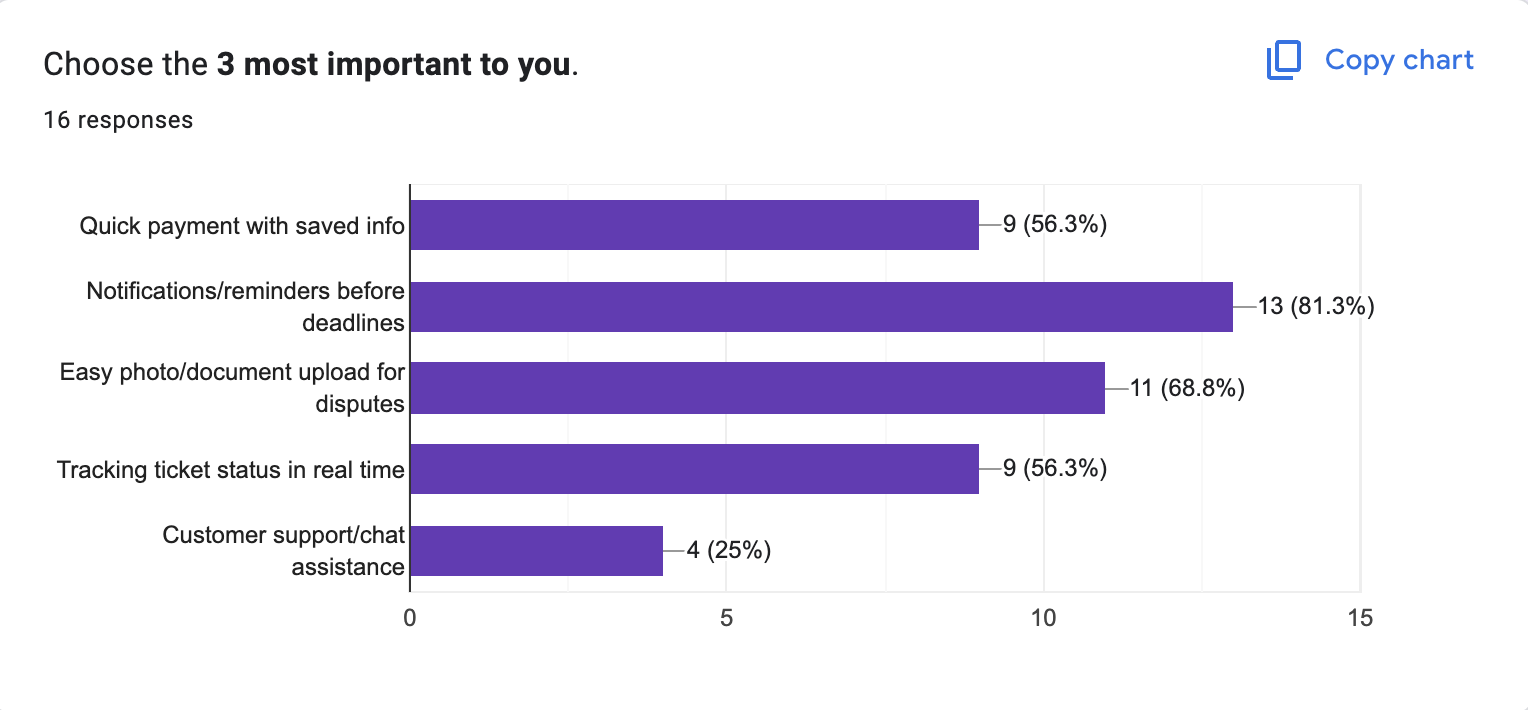
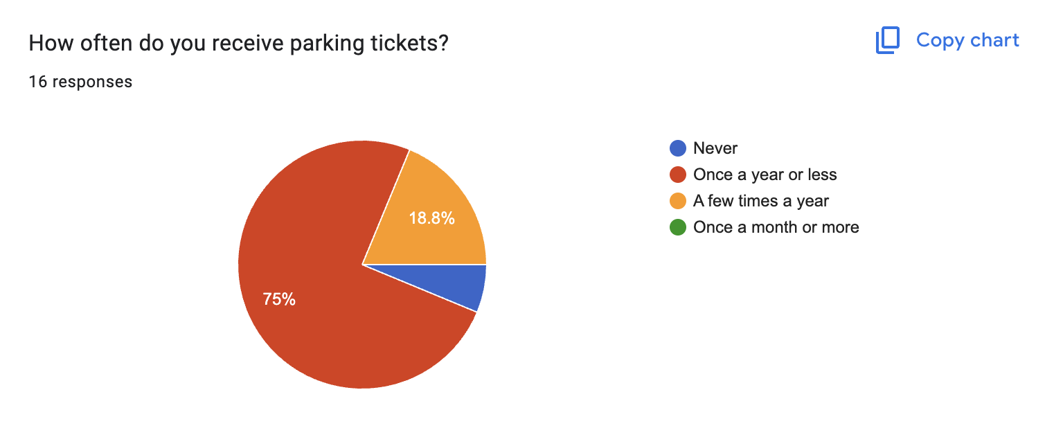
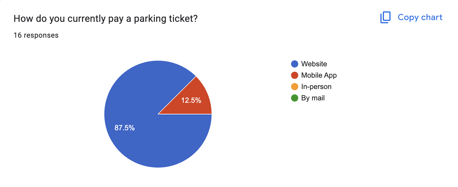
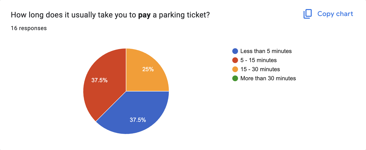
In addition to the graphs above, here are some questions that had short answer responses:
Design Strategy & Ideation
The insights, journey map, and storyboards show that users need a faster, more trustworthy way to resolve citations. To address these needs, I focused on designing an experience that emphasizes clarity, efficiency, and confidence at every step.
Prototype & Testing
User Testing…

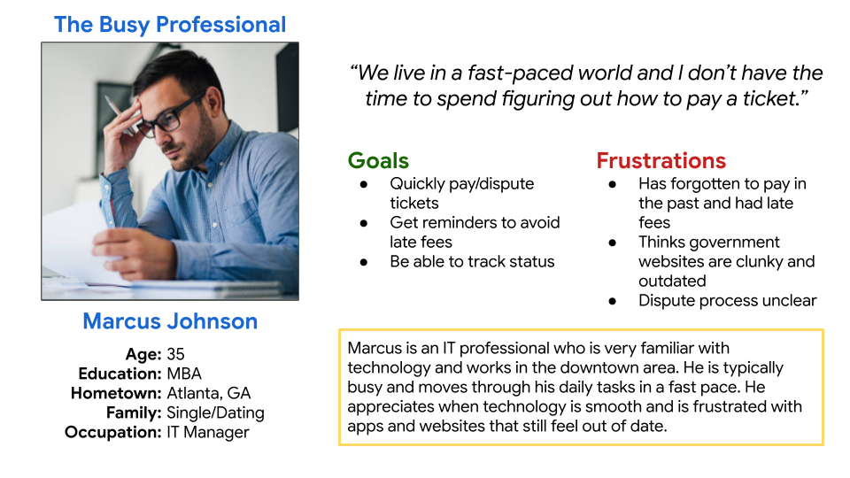
Personas:

Journey Map:
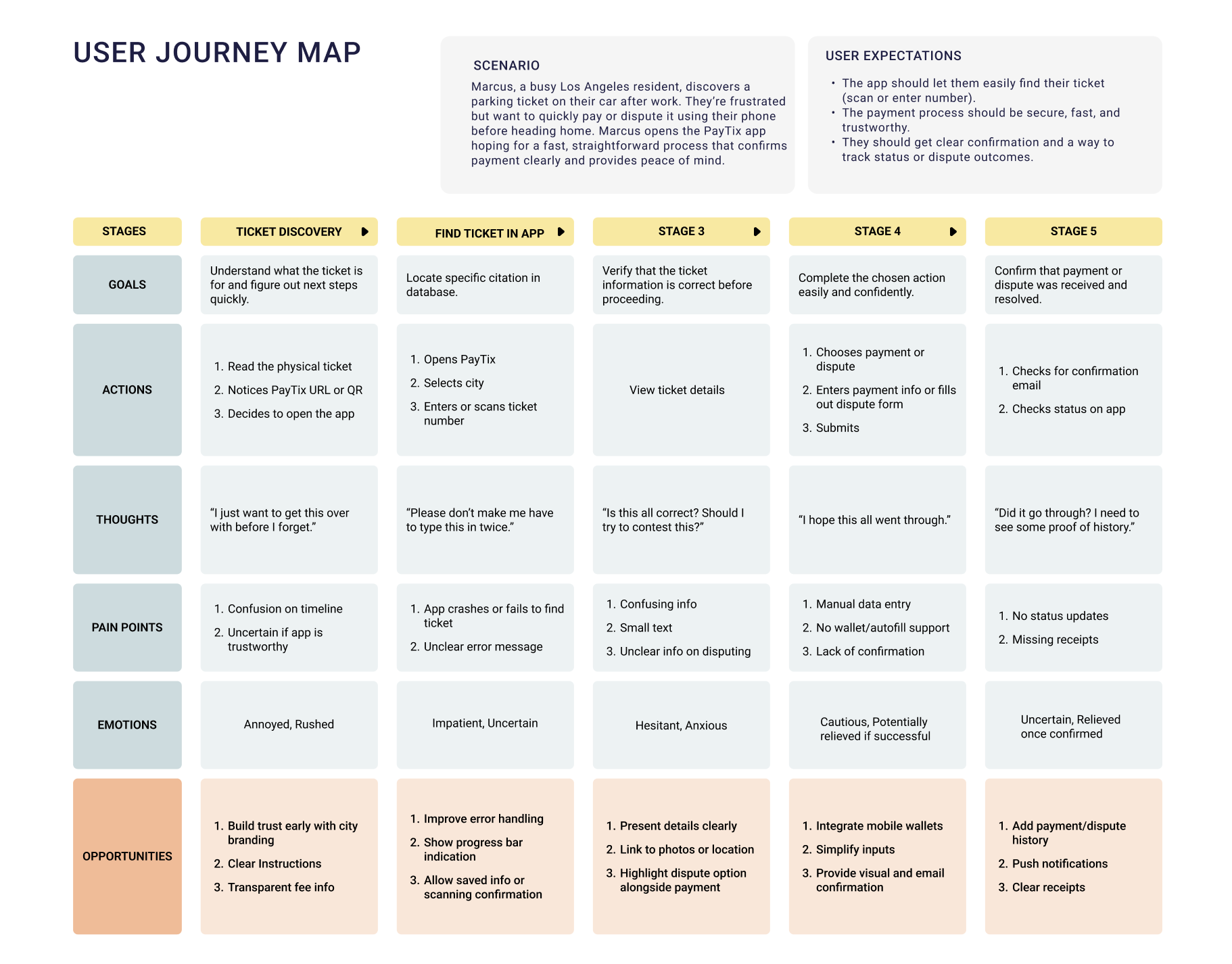
Insights:
Paying or disputing a parking ticket is a low-emotional-reward, high-anxiety task. Users like Marcus want to get in, complete the action confidently, and move on with their day. The redesign should remove unnecessary steps, communicate trust and clarity at every stage, and support seamless follow-up visibility.